How Accurate Are Penis Size Studies?
Two studies can report an “average penis size” more than a centimeter apart, both peer-reviewed, both published, both cited with a straight face. The gap has almost nothing to do with the men. It is about who held the ruler, how hard they pressed it, and which men ever made the dataset. Learn those three mechanics and most of the scary numbers online stop being scary. They become noise.
Who held the ruler decides almost everything
The first question to ask of any size statistic is not “what was the average?” It is “who measured it?”
Self-reported numbers run large. Every time. These are the figures from online surveys, dating-app data, and that poll your group chat keeps forwarding. Some of the inflation is honest rounding: 5.8 becomes 6, somehow never 5.5. The rest is selection. Men who volunteer for a penis-size survey are not a random slice of humanity, and the confident ones flood the sample. A tape measure held by a motivated owner is not a neutral instrument. The errors do not cancel. They all lean the same way.
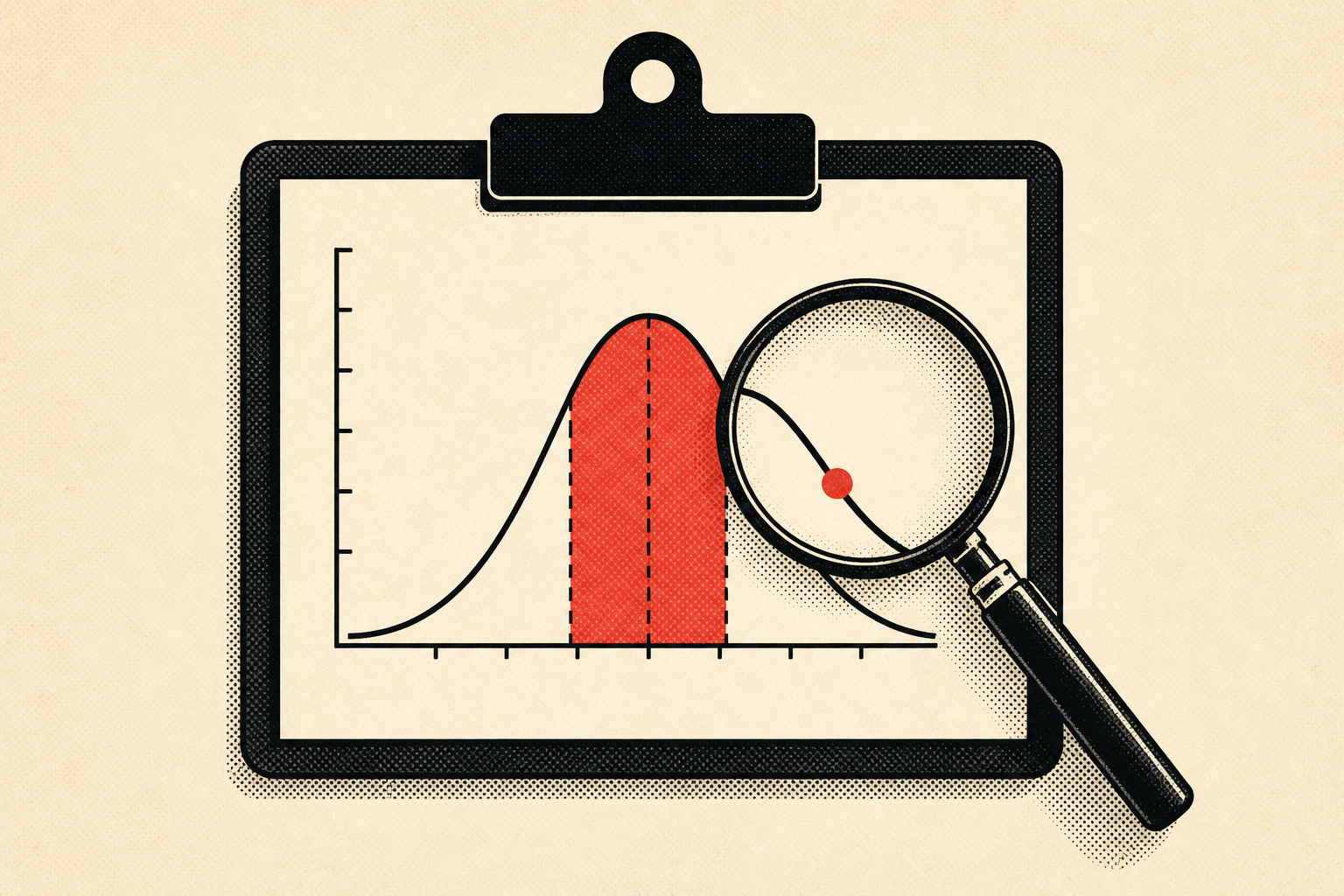
Clinician-measured numbers come back smaller, tighter, repeatable. A trained measurer with a standard technique strips out the wishful thinking, and when a second clinician redoes the job, the figure barely moves. That repeatability is the entire point of research. It is why we anchor the calculator to Veale et al. (2015), a systematic review pooling clinician-measured studies covering up to 15,521 men. The headline figures: erect length of 13.12 cm with a standard deviation of 1.66 cm, and erect girth of 11.66 cm. The methodology page shows exactly how we use them.
That standard deviation is quietly the most useful number in the whole review. An SD of 1.66 cm means the curve is narrow. So narrow that roughly 90% of men fall between 10.7 and 15.5 cm erect. A span of under two inches holds nearly everyone.
Picture what that does to a population. Take 1,000 men. About 680 land within one SD of the mean, between roughly 11.5 and 14.8 cm. Push out to two SDs and you have enclosed about 950. So the man who is 17 cm erect is not “a bit above average.” He is deep into a tail that holds a handful of people per thousand. And that handful is exactly who everyone pictures when the topic comes up, because they are the only ones who volunteer the number unprompted. The quiet middle, where you almost certainly live, never says a word.
Bone-pressed, or how to lose two centimeters by accident
One measurement detail wrecks more home calculations than everything else combined. Research measures erect length bone-pressed: the ruler is driven firmly into the pubic bone, compressing the fat pad in front of it. That is the standardized method, and it is why clinical numbers line up across studies.
Measure casually at home, ruler resting on top of the fat pad with no pressing in, and you will read 1 to 2 cm shorter than the studies you are comparing yourself against. Then you do the arithmetic, land on “below average,” and feel terrible over a gap that is pure technique. A heavier pad widens the illusion, which means the men most likely to misjudge themselves are often the ones already most anxious. Rough deal.
The unfairness compounds, because the two errors stack the same direction. The anxious man under-presses and compares his soft number against a hard-pressed research average. He gets penalized twice for one slip, and the correction can erase the entire imagined deficit. We have watched people talk themselves into months of worry over a centimeter and a half that a firmer ruler hands right back.
Our calculator corrects for this when you tell it how you measured, but the cleaner fix is to measure right the first time. The how-to-measure guide walks through it. The difference between flaccid and erect readings is worth knowing too, since flaccid length is a famously useless predictor of erect length and swings with temperature and mood.
A few habits tighten a home measurement more than people expect. Measure when you are fully, reliably erect, not partway. Stand up instead of lying down, since lying flat lets the pad bunch and reads short. Press the end of a rigid ruler, never a soft tape, straight back to the bone along the top of the shaft, and read where the tip lands. Do it two or three times across different days and take the typical value, not the best one you ever hit. The goal is not a flattering number. It is the same number a clinician would write down, because that is the only number the studies can be compared against.
Country maps are entertainment, not evidence
You have seen the colorful “average size by country” maps. They get shared constantly, and as data they are close to worthless. Treat one like a horoscope that happens to use centimeters.
The problems pile up fast. The maps pool wildly different studies that used different methods, bone-pressed in one country, self-report in another, stretched length somewhere else, then rank them against each other as if the numbers were comparable. They lean hard on self-reported figures for whole nations. And they are almost never nationally representative; a study of 200 urology patients in one city becomes “the average for the country.” Stack three sampling failures on top of one another and the ranking tells you who ran which survey, not anything real about geography. If you want the honest version, see how rare your size really is.
Run a map through a gut check and it collapses. Pick the top country and the bottom one. The “gap” between them is often smaller than the error from one careless home reading, or it is just one nation reporting self-measured data and another reporting clinical data, a methodological mismatch dressed up as a biological fact about millions of men. If the same lab measured both populations the same way, the dramatic rankings would flatten into a blur, because variation between individuals dwarfs the average difference between any two countries.
We still publish a country comparison, because people want it and it is a fun rabbit hole. But it is labeled for what it is, and it never overrides the clinical percentile. When a map and a peer-reviewed measurement disagree, trust the ruler.
The tails are blurrier than the middle
Even inside a gold-standard review, not every part of the distribution is measured equally well. The erect figures in Veale came from far fewer men than the flaccid or stretched ones, hundreds rather than thousands, because arranging a clinical erect measurement is genuinely awkward to pull off. Stretched length is the usual stand-in for exactly that reason: it is easier to collect.
Smaller samples mean wider uncertainty, and the uncertainty is worst right where people care most, at the tails. The clinical threshold for micropenis is roughly under 9.3 cm stretched, 2.5 standard deviations below the mean, and true micropenis is rare. It is a specific medical diagnosis, not a synonym for “small.” The micropenis explainer covers what the diagnosis actually involves, but the short version is that almost everyone who fears it does not have it.
There is a counterintuitive lesson buried here. People assume the scariest statistics, the ones about the very small or very large, are the most carefully nailed down, because they are the most talked about. The opposite is true. A claim about “the bottom 1%” rests on the thinnest slice of data in the whole study, often a few dozen men, sometimes recruited because a clinic was already treating them for a concern. So the tail figures carry the widest error bars and the most selection bias at once. The center of the curve is built from the most men measured the most consistent way. The number you can trust most is the one describing where most people actually are, which happens to be the number least likely to alarm you.
Why two honest studies still disagree
Suppose every study you found was clinician-measured, bone-pressed, and decently sampled. They would still report slightly different averages, and that is not a scandal. It is how measurement works.
Sampling is the big one. Any study measures a few hundred or few thousand men, not all of them, so its average wobbles around the real value by chance. Recruitment matters too: a fertility clinic, a sexual-health clinic, and a university each draw a slightly different crowd, and those crowds differ in age, weight, and ethnicity, all of which nudge the number. Even the protocol drifts. One lab induces erection pharmacologically and measures at full rigidity; another measures self-stimulated erections that may not be maximal.
None of that is fraud. It is why a review that pools many studies, like Veale, beats any single headline figure: pooling averages out the wobble no individual study can escape. So when you see one study trumpeting an unusually high or low average, the right reaction is not excitement or panic. It is “interesting, where does it sit relative to the pooled estimate?” And the pooled estimate is the one we build the percentile calculator around.
What a “big” study still will not tell you
Sample size and good technique tell you how common a measurement is. They say nothing about what anyone prefers, and people mix those two up constantly.
Prause et al. (2015) went straight at the preference question, having women choose from a range of 3D-printed models. The result was not that one dimension wins. Preferences clustered around the average and a touch above, with no consensus that bigger is always better. For most people, partnered satisfaction tracks things a tape measure cannot read at all, and what women actually prefer is rarely the locker-room answer. The does-size-matter breakdown and the girth-vs-length comparison dig in further. When girth comes up, it usually matters at least as much as length, which the maps and the rankings ignore entirely.
So a study can be enormous, clinician-measured, perfectly bone-pressed, and still answer a different question than the one keeping you up at night. “How common is this measurement?” and “does this measurement matter to a partner?” are separate questions with separate evidence, and conflating them is how a man with a perfectly ordinary measurement convinces himself there is a problem. The size data describes a distribution. The preference data describes a soft, average-centered cluster. Neither one supports the anxiety that sent you looking.
A four-question filter for any size claim
Before you let a statistic ruin or inflate your day, run it through four questions. Was it measured by a professional, or self-reported? Bone-pressed, or measured loosely on top of the fat pad? How many men, and how were they recruited? And is it erect, stretched, or flaccid, three different numbers that people swap constantly?
Most of the internet’s scariest size statistics fail at least one question, usually the first. When a figure clears all four, measured, standardized, decently sampled, clearly labeled by state, you are looking at something real. And something real almost always says the same calming thing. The normal range is wide. The middle is crowded. The curve is far narrower than the conversation around it. If you have been measuring yourself against a viral map or a half-remembered survey, swap it for the percentile calculator and a bone-pressed reading. The honest number is usually kinder than the rumor.
FAQ
Why does the average from my favorite online survey look higher than the clinical figure? Because online surveys are self-reported and self-selected. Men round up, and the men confident enough to enter a size survey skew large to begin with. Clinician-measured reviews like Veale strip both effects out, which is exactly why the methodology page anchors to them instead.
Is stretched length the same as erect length? No, though they are correlated, and stretched is often used as a proxy because it is easier to collect than a clinical erection. They are separate measurements with separate averages, so never compare a stretched number against an erect one. That mismatch is one of the four filter questions for a reason.
Should I trust a “size by country” map over a percentile calculator? No. The maps pool incompatible methods, lean on self-report, and rarely use representative samples, so the rankings reflect study design more than geography. When a map disagrees with a clinician-measured percentile, the calculator and a bone-pressed measurement win every time.